Number of daily content unique viewers
+25%
**After distribution in April, average in May
UX개편
Role: UX Design, Research

01 Business Side: A lifestyle app that you will come back to even after you finish decorating your home
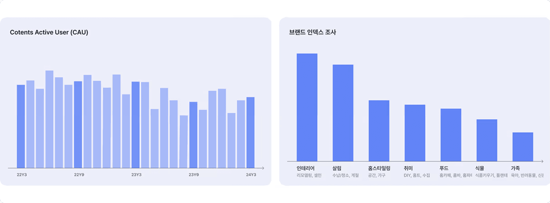
Ohouse has grown around practical content such as 'home decoration', 'know-how', and 'reviews'. However, in recent years, content time spent (CAU) has started to stagnate. A new growth lever was needed, so the Lifestyle TF was formed.
Based on the user data and research we have accumulated, our team defined the information imbalance that occurs in areas closely related to home and daily life. We also reorganized the content navigation structure so that users can continue to discover and consume new content even after interior design and moving.
02 Customer Unmet Needs: Even after decorating the house, everyday problems do not end
Visitors to Ohouse are not only interested in ideas for changing space, but also in housekeeping, storage, and plants.To solve big and small problems in everyday life, such as raising children, look for photos, housewarming, and know-how content posted by other users. Rather than direct guides, indirect solutions and inspiration were often obtained from the actual experiences and records of users who had experienced similar situations.
In fact, in the 2022 Brand Index Survey, 64.5% of those who recognized Today's House answered that Today's House is helpful in solving daily problems at home, such as childcare, housekeeping, and pets, beyond living and interior design.
The ‘Browse Tab’ was out of sync with the user’s navigation mental model
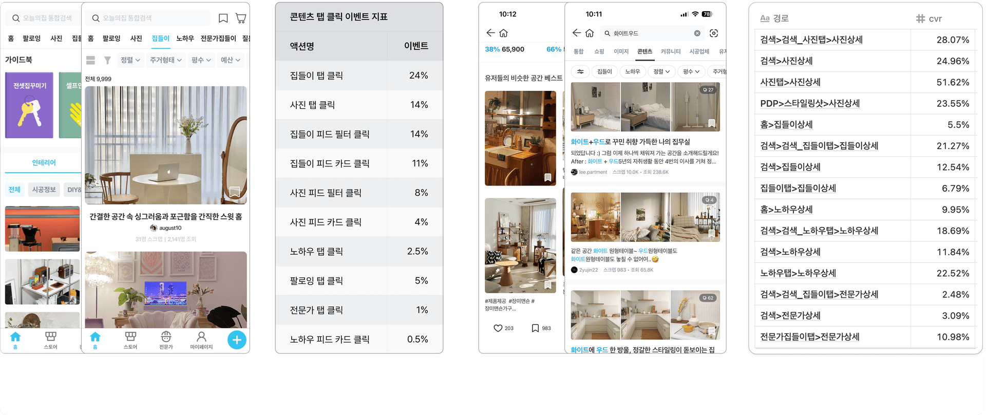
Interviews showed that users were looking for content to solve specific life problems such as 'home decoration', 'storage', and 'space separation'. However, the content tab was organized around content types such as housewarming, photos, and know-how. The context the user expected and the structure of the tab itself were misaligned. Perhaps that's why the content tab conversion rate was only around 10% on average.
When I looked at the click data, it was a similar picture. Home styling content, such as housewarming and photos, received a lot of clicks, but problem-solving content, such as know-how and expert content, had a low percentage of people coming directly from the tab. Following the path, I found that users first look for topics other than home styling in search rather than in the content tab, or bypass them and consume them through the recommendation feed at the bottom of the content detail page.There was.
Key Solutions
Popular Keyword Feed: The first tab of the explore tab lets users browse home-related interests broken down into granular keywords, designed so people don't miss fast-moving micro-trends.
Topic Tab Feed: The second is a topic feed that sits as a fixed top tab within the explore tab. It lets users keep exploring content by following their interest keywords, so they can browse more intuitively and broadly for content that fits their taste and situation.
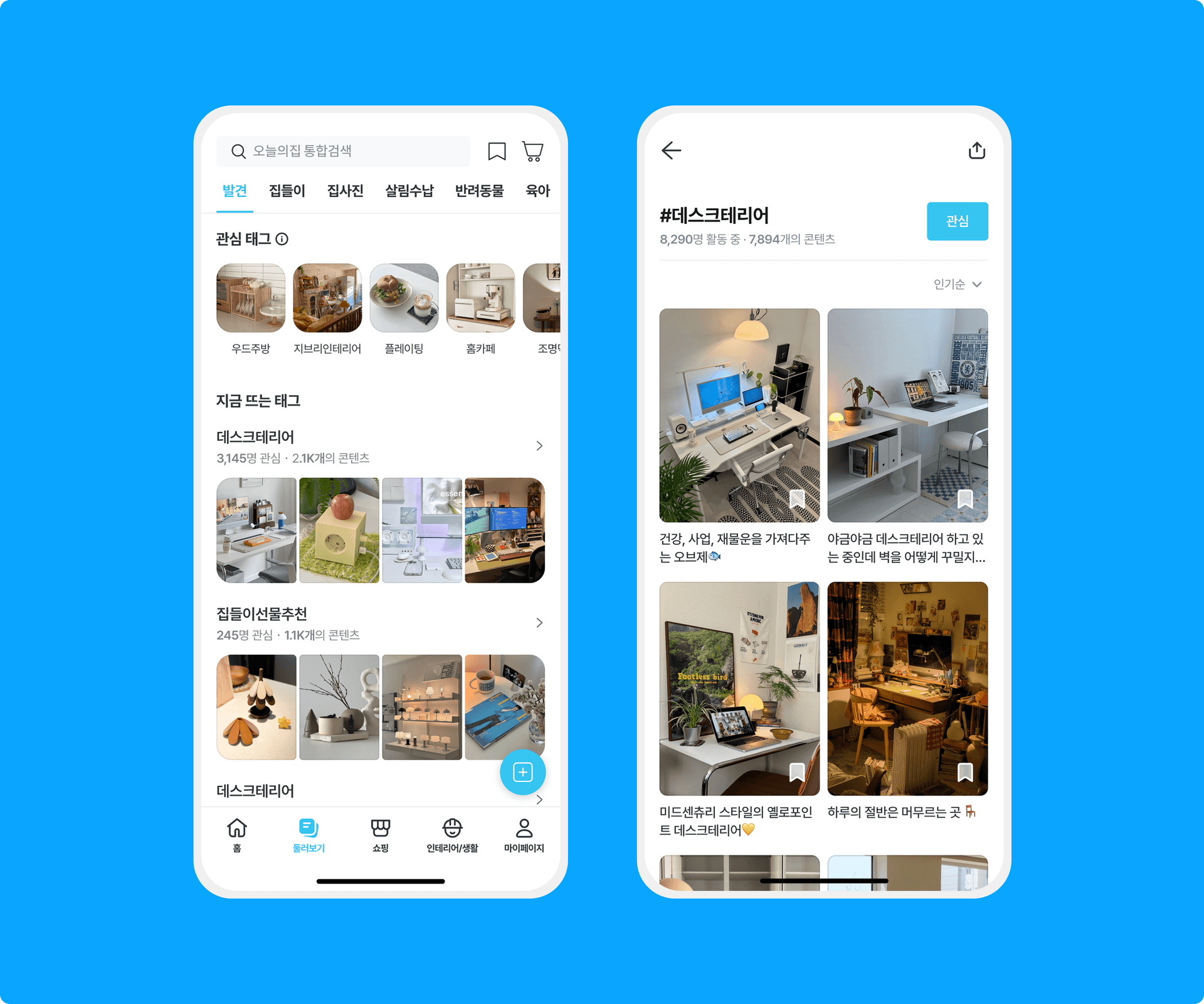
This work involved restructuring the exploration flow on the customer-facing side, while on the backend, we shifted the content classification system — previously labeled mainly around format — to be based on richer metadata like hashtags and topics.
We fell short of the tab retention target we'd originally set after the redesign, but did see some gains in content view and reaction conversion metrics.
Impact
Daily unique content viewers: +25% (April launch, average for May)
D+1 channel tab average retention: +27% (August launch, average for December)
The shift in these two metrics before and after the redesign was a clear lesson: at least among users actively viewing content, classifying by "interest topic" drove noticeably higher engagement. That data-backed conviction became the basis for the larger-scale iteration that followed: the home feed redesign.
Number of daily content unique viewers
+25%
**After distribution in April, average in May
D+1 Channel Tab Average Retention
+27%
**After distribution in August, average in December
Not every experiment succeeds. But I think the real reason we run experiments isn't the outcome itself — it's validating the hypothesis and pulling a lesson learned from customers. The explore tab redesign didn't reach the retention target we'd set, but the conviction that experiment left behind is what let us move forward to the next one.
2026

2026
april, 2026
Nov. 2024

Jun. 2024
2026